One Piece - Translating an iconic manga into the live action world
I can’t pretend I knew about One Piece when I was approached to design the first live-action series but my (grown up) kids were quick to put me out of my ignorance; “OMG dad! Everyone knows about One Piece”. And they were right: One Piece is the biggest, longest-running, and most popular manga ever, with a huge world-wide fan base, some following the story for over 25 years, carrying their own imagined world of the characters and story. The design challenges on starting this project were daunting.
The One Piece world is a fantastical mixture of historical piracy, everyday reality, and high fantasy. Pirate ships are painted pink, and have giant duck figureheads. Evil clowns, cats and Fishmen are pirates, and the best restaurant is a giant galleon, with a fish head prow. The scale of the world is equally vast; this series covers only a fraction of the world in the mangas. The story moves on every two episodes to a new part of the East Blue Sea, a new world, and completely new sets.
THE GOING MERRY - Concept Illustration by Jakub Vykoukel
Working with a large team of concept artists, including regular collaborators, ADG 800 concept artist Matthias Beeguer, Jakub Vykoukal, as well as South African artists Fred Mpuuga, Deon deLange, and André Human, the first big challenge was to discover the visual language of One Piece. In the way sci-fi movies are often period movies projected into the future, I based the world in 18th century piracy. It was important to have this recognisable, relatable reality on which to build the fantasy. We worked with an ever-expanding reference library, and my loose sketches, where drawing is really thinking at this stage.
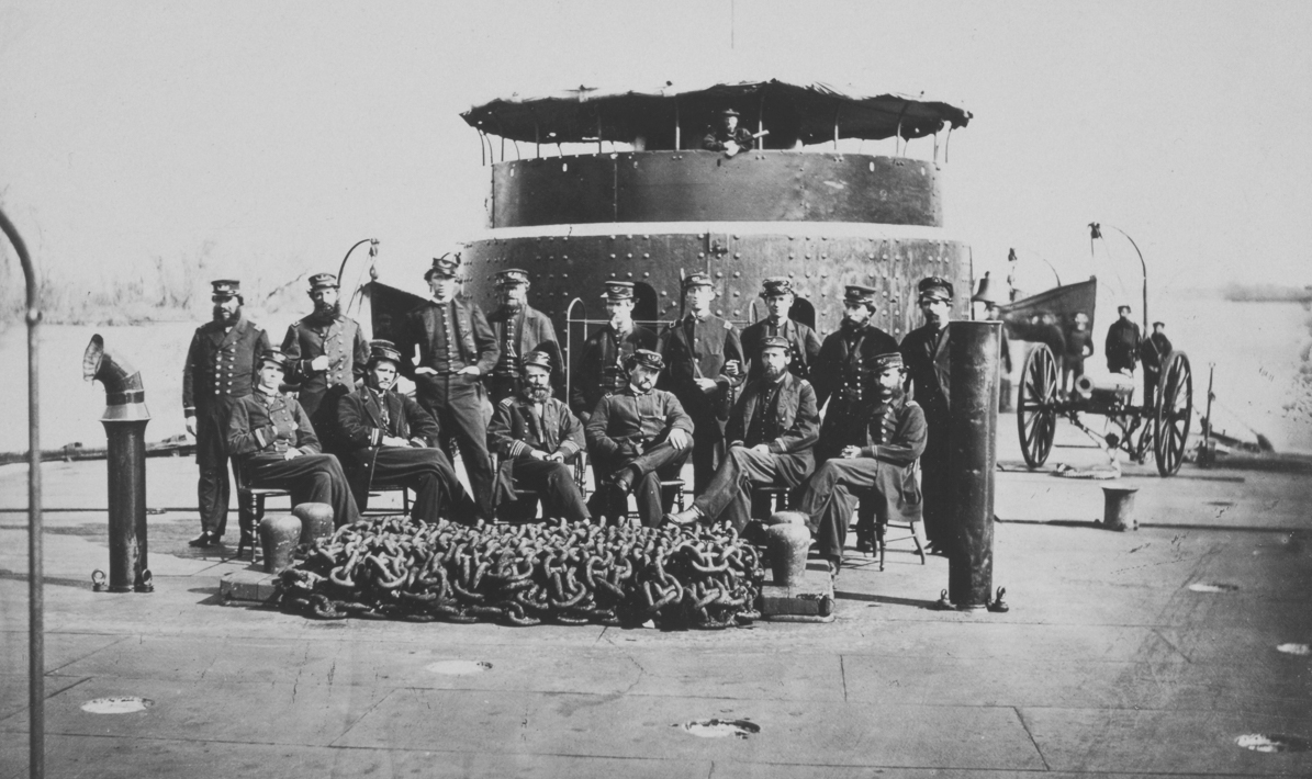
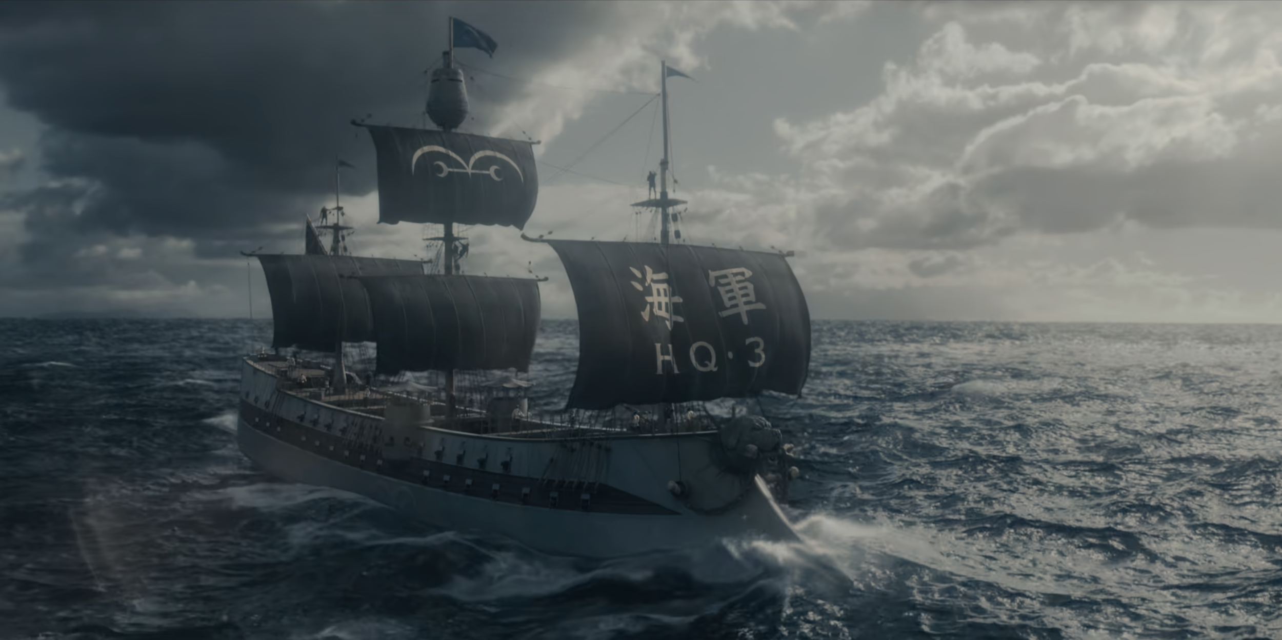
Our constant question of each of the concepts was “Where’s the One Piece?” in each set. As a guide I referred to Oda’s book, the Ruruba, which illustrated his real world inspirations for many of the settings. So Loguetown, in the opening of the show is based in Florence, Italy; The pagoda in Arlong Park, later in the series, is based on China’s Great Pagoda. But it also gave me license to use other cultures, so Cocoyashi Village, Nami’s home village, I based on traditional Indonesian vernacular, and it’s extraordinary roof profiles. But finding the One Piece was also adding anachronisms, like a refrigerator in the Galley of the Going Merry, or making Garp’s warship a 19th century ironclad, with gun turrets inspired by civil war Mississippi gun platforms.
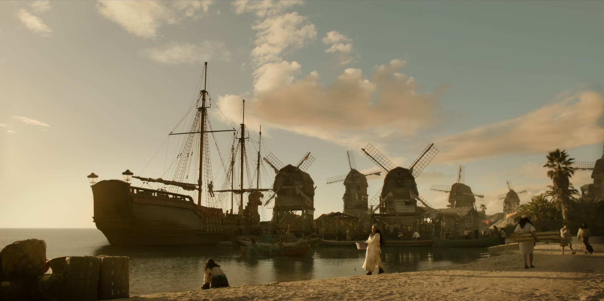
Focused storytelling stopped the fantasy from being mere whimsy, and gave everything its own internal logic. Every set had a history, based on close character readings. Windmill Village, Luffy’s home in the pilot episode, is where he learns his love of pirates, so it was no longer vaguely Dutch like the manga, but built over water as a fishing village, and refuelling station for pirate ships. Arlong Park was built by the fishmen from stolen carnival booths, a classic horror movie trope that can quickly switch from party atmosphere to sinister horror, just like the character Arlong.
Ships are central to any pirate story, and One Piece has five hero sailing ships, a giant floating restaurant, the Baratie, as well as a slew of smaller vessels. Cape Town film studios in South Africa already had a full-size galleon, and a large sloop left over from another show, that we could adapt for some of our main ships. Along with three tanks, good-sized stages, and a large backlot for our exterior sets, it was an obvious choice to film One Piece there.
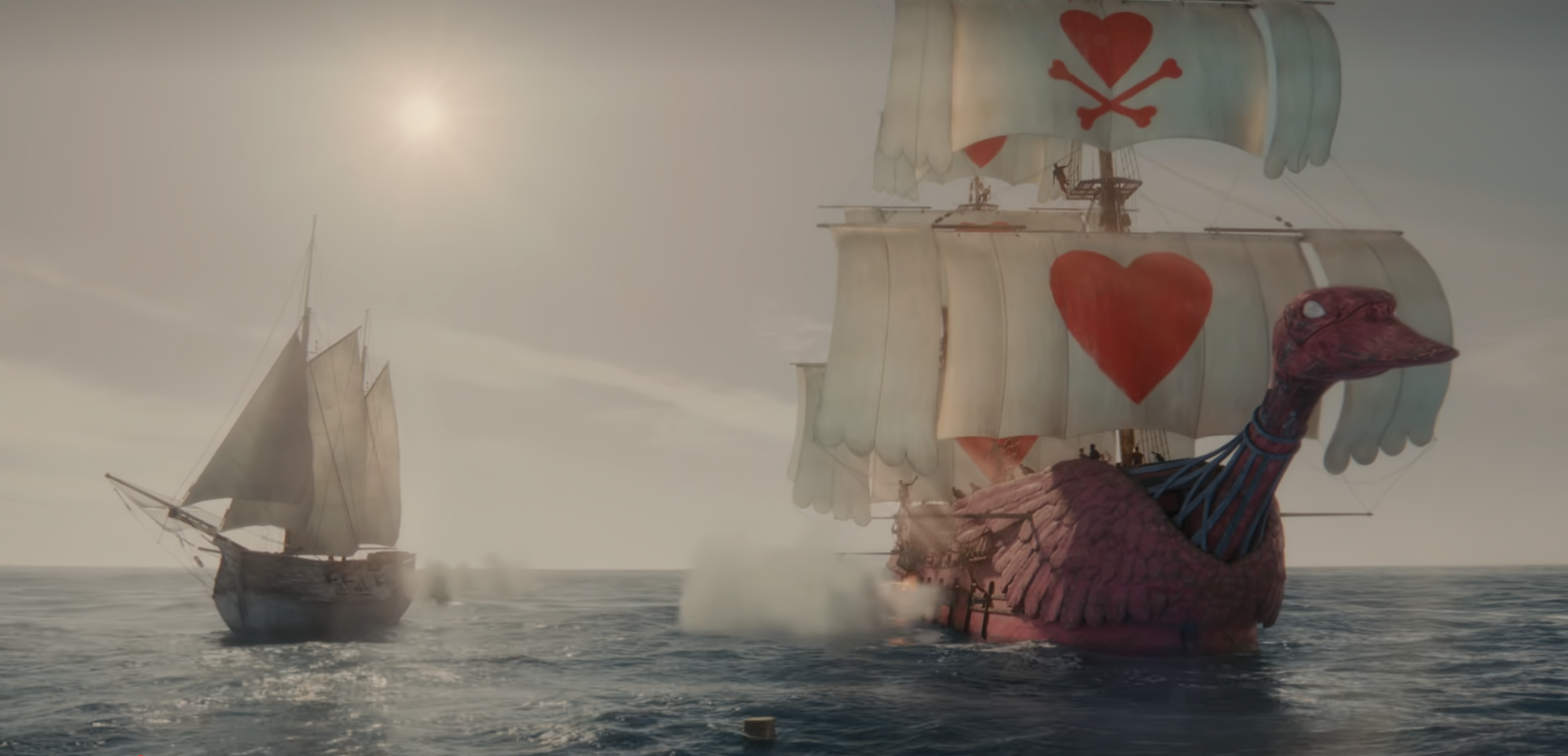
The ships had been sitting on the backlot for several years, and required extensive renovations even before we could begin to adapt them to my designs. The galleon was first remodelled into Alvida’s pirate galleon the Miss Love Duck. The very talented Art Director Catherine Gaum and was my teacher and mentor on all things ship-related. For the Love Duck she largely kept to the architecture of the galleon, but we added an MGM-style walk-down staircase from the poop-deck, in reference to Alvida’s extreme vanity.
The other main interventions were sculpting the giant duck figurehead, and two pairs of giant duck wings that we fitted to the prow and stern. Ross Meiling’s amazing fabrication department, under head sculptor Keanu Botha, gave the figurehead the perfect fierce expression, and much-needed realism. To make a pink pirate ship look real and credible required the talents of master scenic Liz van den Bergh and her team, who meticulously added layers of under-painting which they revealed in the ageing process. The result was a gritty, textured, and very pink pirate ship.
We adapted our shoot schedule to accommodate changing the Love Duck into Garp’s Warship. The transition from 18th century wooden pirate galleon to 19th century ironclad was radical, but achieved with elegance and simplicity in Catherine Gaum’s set designs. In cladding over the sloped decks, and straightening the lines of the ship, we were also indebted to the knowledge and experience of veteran construction foreman Gary Brown, who had previously built all the ships on the lot, and who managed to achieve the extensive turn-around in the scheduled eight weeks. The finished ship was unrecognizable from the old galleon, whilst the fabrications team added the Bulldog figurehead. As only a few shots would be from the exterior, we sculpted the top-half, VFX adding the rest when needed.
The Going Merry is the hero ship in One Piece, and would be a focus of the fans attention, so its appearance was crucially important. I inherited a previously-built version of the ship, which required serious adaptation to make it credible, while some of the deck architecture needed redesigning to create filmable playing areas. The main remodel was to the figurehead, and the sculpted horn motifs that clad the ship. This is an icon of the manga, and beloved by fans, so for the design I again turned to story-telling, with the figureheads embodying their characters’ attributes. Luffy is strong, unconquerable, and always laughing in the face of danger, so a laughing ram brought the cartoon figurehead into the real world. Once again Keanu’s team of sculptors captured the expression perfectly.
The production response to my design for Nami’s sloop was “There’s no money to build it, you’ll have to figure it out”; sound familiar? My art team came to the rescue and unearthed the unfinished hull of a Chinese Junk boat stored on the lot. Set designer Marcel Bryard adapted the original design, inspired by the elegant Bermuda sloop style common in the 18th century, to the new hull and created a unique vessel, perfect for Nami’s character, complete with a cabin that worked for exterior and interior. Construction foreman Hennie Goddard sensitively realized the build, and ironed-out the natural problems of adapting the design to an existing hull.
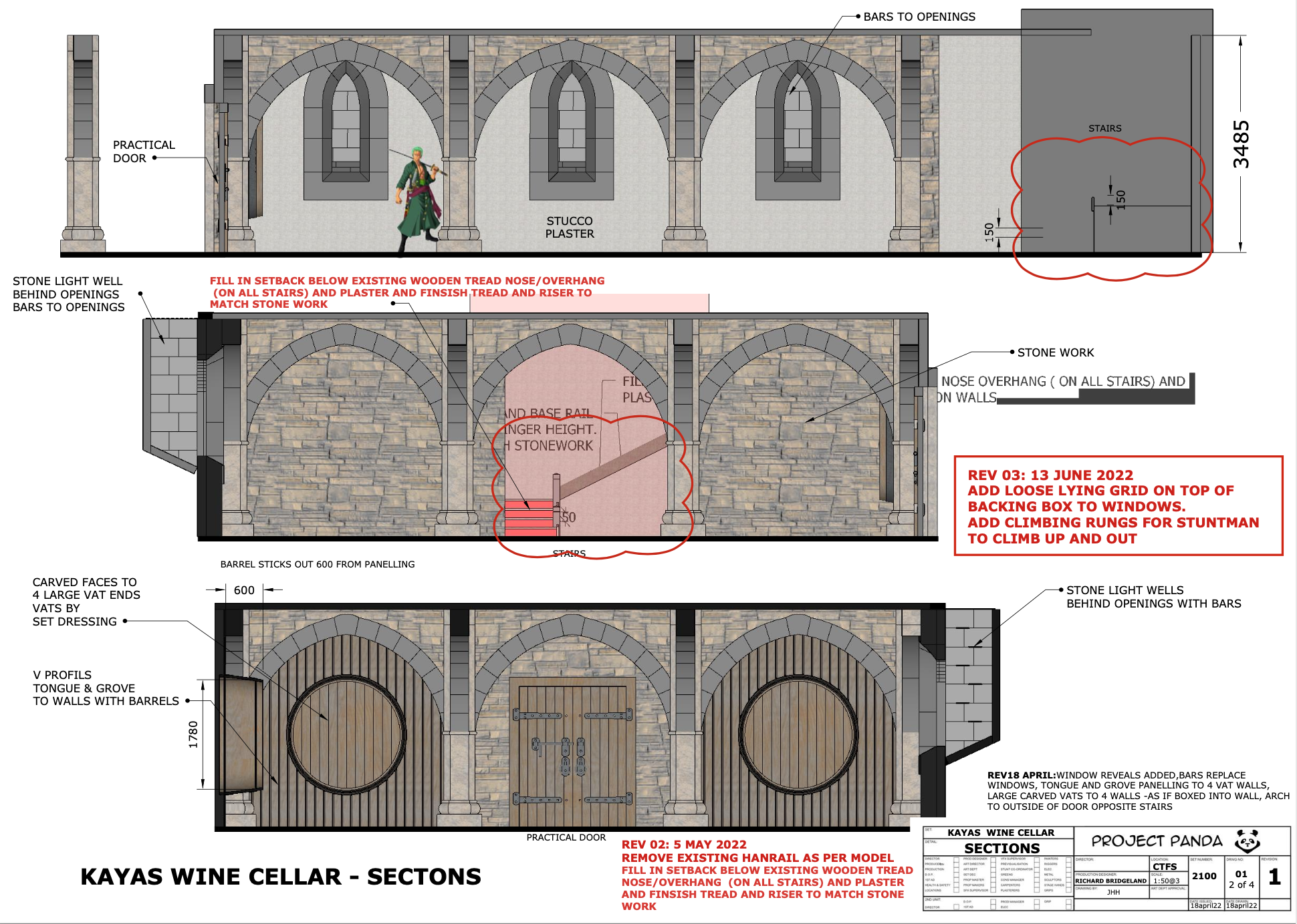
The stage sets presented their own problems. “I’m not a bloody magician” were Supervising Art Director Mark Walker’s first words on finishing the set list; “How the hell are we going to fit twenty five-plus sets onto five stages?”. It turned out he was a magician, and he kept the carousel turning of setting and striking sets to a very tight schedule. Where possible I re-vamped sets for ones later in the shoot schedule, such as the Marine Map Room, which became Kaya’s Wine Cellar, and the Shells Town Tavern, where I used the main architecture to create the East Wing Suite, site of the climactic final showdown in episode 6. Other sets remained standing for the duration of the shoot, such as Garp’s Cabin on his warship. Somehow Mark managed to find room for them all.
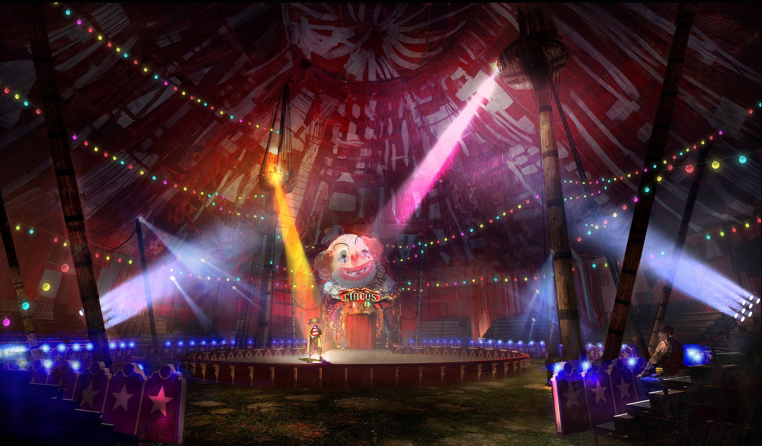
A big challenge on stage was to fit a giant circus tent that would literally fill one stage. Senior Art Director Jonathon Healy-Hutchinson drew the layouts, and with the assistance of Set Designer Werner Hendrich created a large oval ring at the top, to allow lighting from the grid, and stunt lines for the multiple acrobatic and fight rigs needed. The tent was a patchwork of striped sails, as if made from the old sails of Buggy’s pirate ship. To give it form Jonathon used my references of dazzle camouflage used on WW1 battleships.
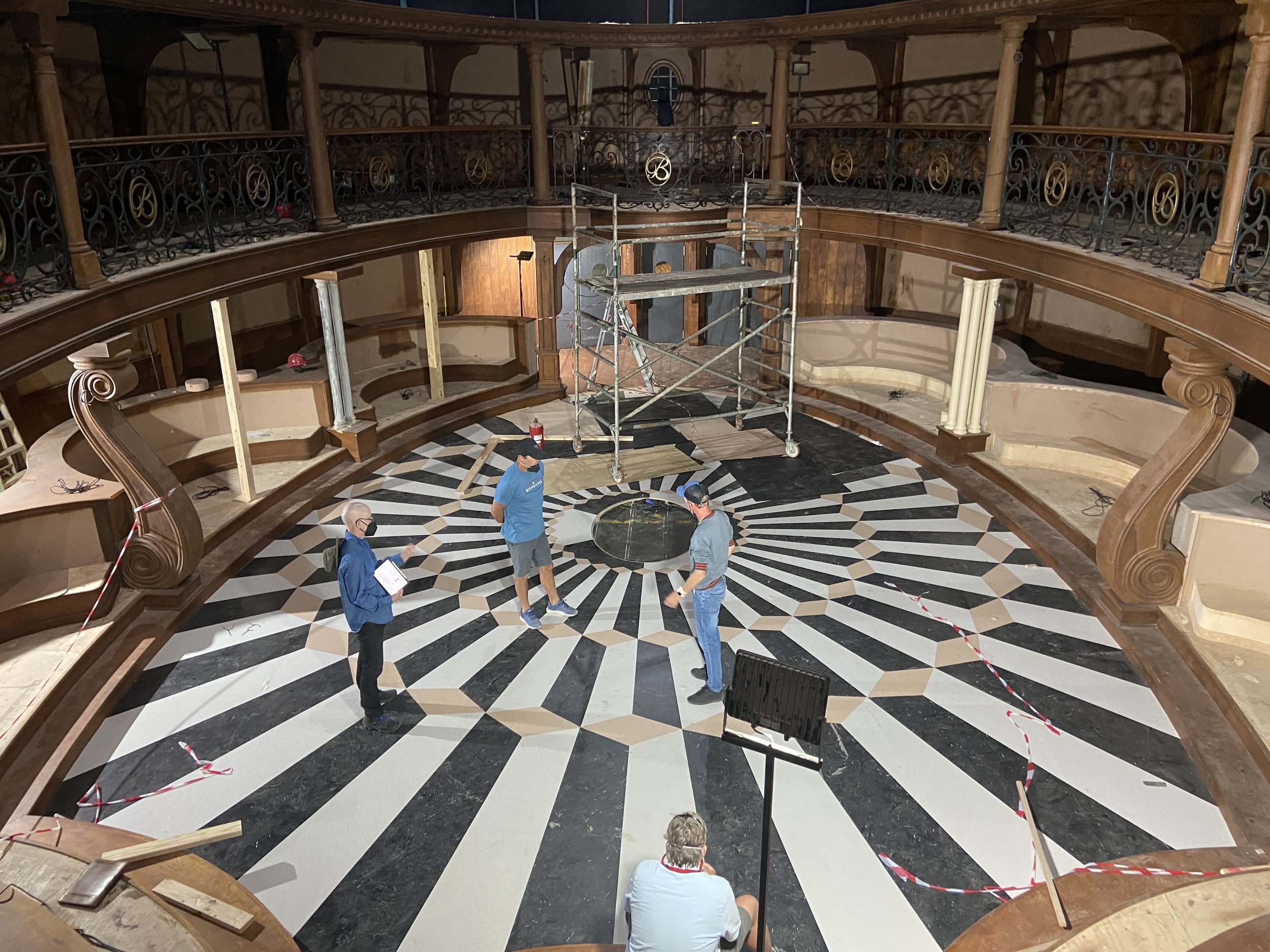
The dining room and kitchen of the Baratie restaurant took up most of one of our warehouse stages, which was built as a composite set, with views from one to the other. Multi-skilled Art Director Alan Munro spent many days meticulously solving the problems thrown up by a two-tiered oval space, with curved booths ringing the edges. The ceiling had to be left off for lighting and rigging, but I charged master illustrator Fred Mpuuga with realising a nautical painted ceiling for VFX to use in post.
The Baratie dining room and kitchen give an great example of the extent of work, care and detail that went into each set. The brilliantly imaginative set dec department under Set Decorator Tom Hannam cut a stash of worn-out Persian rugs into a collage of patterns for the flooring around the edge of the dining room, and collected a wide variety of lamps, crockery, cutlery and glasses for the dressing. Our story was that Zeff had created this place from troves of stolen items in his former career as a pirate. I researched myths, legends, and places in the One Piece world that the owner Zeff would know, to create paintings for the walls of the dining room, beautifully rendered by concept illustrator Andre Human. And the ever-imaginative graphic designer Emlyn Nield and his team created One Piece menus, drinks labels, and even diagrams of meat cuts from One Piece lore. All for two sets, out of a total of 119.
Sets spilled over onto the backlot, some requiring old-school art department techniques. One of the shallow tanks had a beach, ringed by large fibreglass boulders, the perfect setting for Luffy’s home, Windmill Village. I’m still a fan of old fashioned models, and here the exquisite work of modelmaker Anton Koch proved invaluable in designing the layout for a complicated chase sequence, as well as all the fight sequences at Partys Bar. The set was such an organic structure, built largely from reclaimed timber, that it was drafted by hand, lending the essential character to the set that construction Foreman Andy Gouveia and his team imaginatively interpreted. Andy also solved one of our CGI problems, quietly arranging windmill sails with motors so we could film them all in camera, despite the notorious winds on the Western Cape.
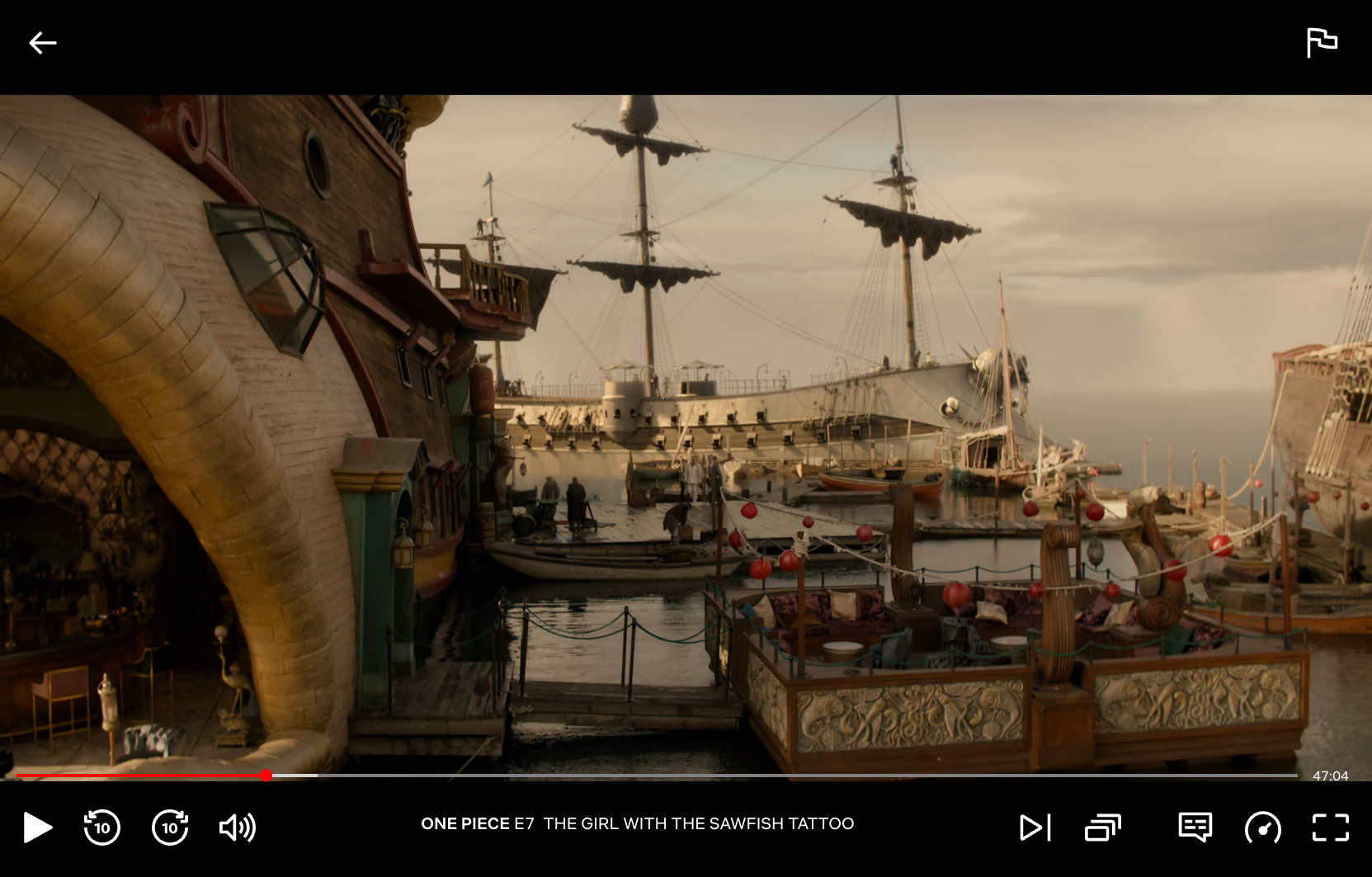
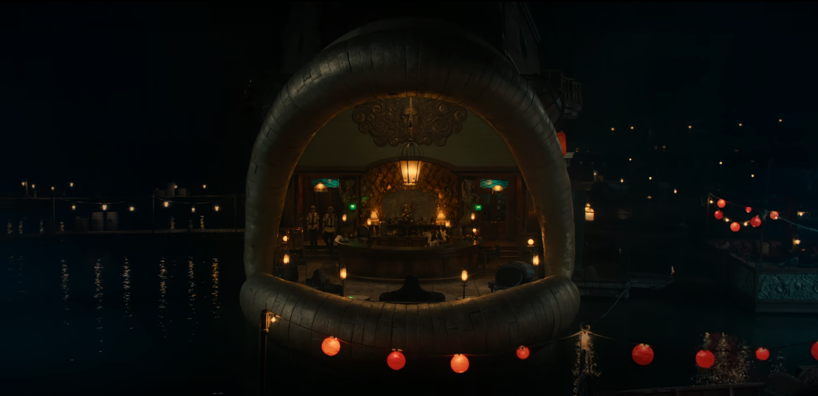
The biggest set on the lot was the exterior of the Baratie restaurant. Deviating from the depiction in the manga, I wanted this set to tell the character Zeff’s story. In my story he used his own pirate ship for the main hull, added two captured galleons above for quarters and offices, with a giant fish head sculpture he found at the pirate reclamation yard, all topped by a lighthouse. To conserve resources I only built one side of the Baratie, and the two galleons above were added in post.
The layout had to allow for all our mobile ship assets to be parked in and around the set, and move when needed. Most were so big they could only be parked around the edge of the tank, but we filled the space with every other ship and boat available. Although we had three tanks, the ships were constantly shuttling between them. Some were motorised and could drive, but giant cranes to lift the ships into the tanks were a regular sight on the backlot. Built in our paddock tank, close to the highway, the Baratie set became an attraction to passing motorists during its construction, and we had to put up a giant screen fence to block the view!
Just as opportunity can be thrown up from locations, so too can the journey of set design, as when I realised the fish head prow needn’t be just decorative. Originally scripted as an interior set, the Dorsal Bar would have been costly, without much gain in storytelling. Placing the bar inside the fish head opened lots of new ways to shoot on the exterior, and proved one of the most original sets in the show.
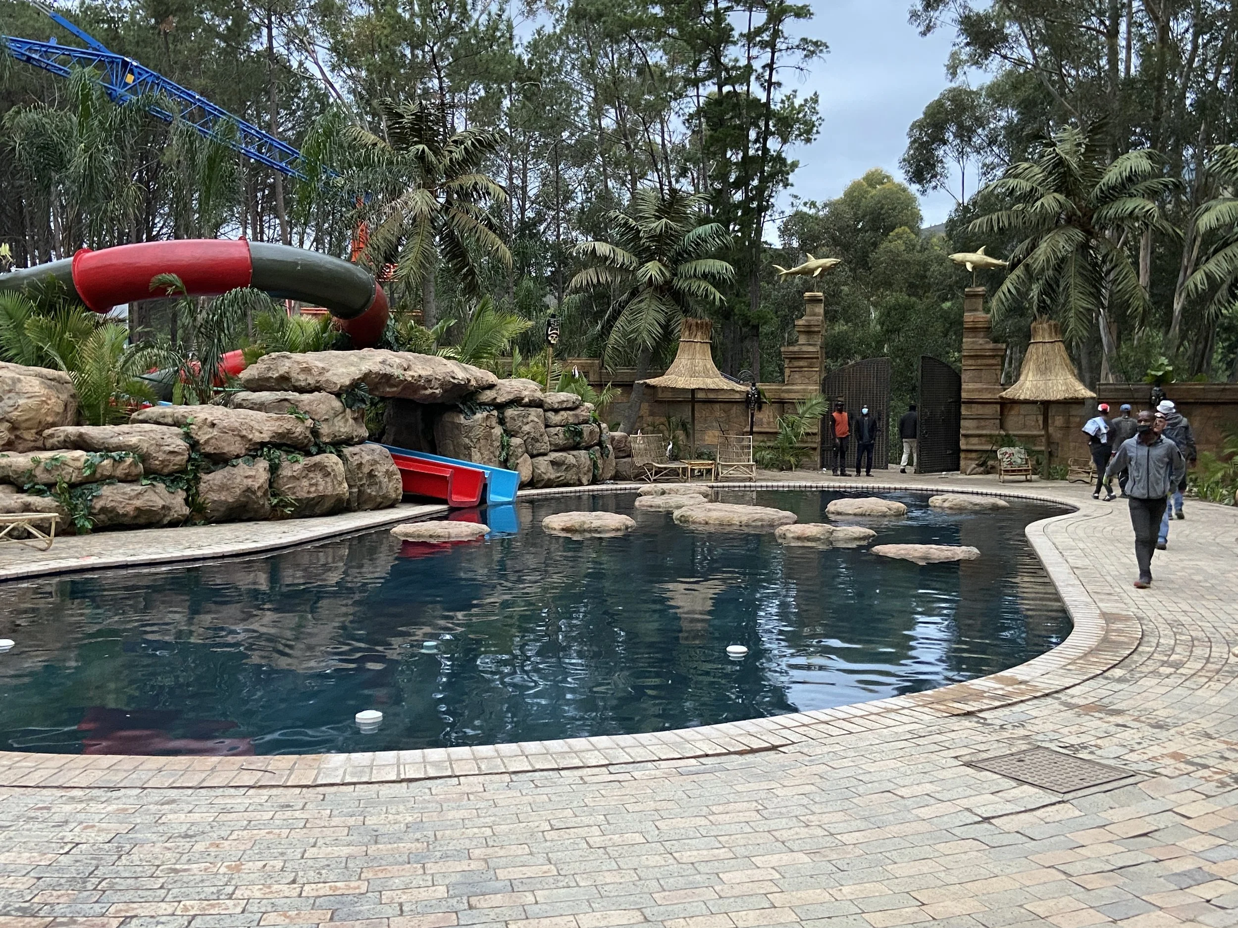
The film gods were smiling on us when I went scouting locations. My brief for the Arlong Park set to Location Manager Katy Fyfe, and Location Scout John Hoeks went like this: “ I need to find a giant, kidney-shaped swimming pool, with no outbuildings, in the middle of a forest clearing”. And then we all burst out laughing at the absurdity of it. But there was a gleam in John’s eye that I came to know and trust. The next day he took me to a farm out in wine country, we rounded a corner, and there was exactly the location I had described. After that he was dubbed the Lionel Messi of locations – he shoots, he scores!
On the same farm John had a location that worked perfectly for Nami’s home, Cocoyashi Village, a main location for episodes 7 & 8: two large clearings in woods ideal for laying out the village, and next to a lake that could double as the coast of the island. Diverging from the manga I based the village on Indonesian vernacular architecture, which made sense of an economy centred on tangerine harvesting, and the simplicity and relative poverty she grew up in. Beautifully realised by art director Ellie Rushworth, she used a combination of CAD for structure, and hand drawing for the organic elements.
The harsh summer sun was the main problem with the location, which I resolved by construction an Ur-mother tangerine tree, that was trellised over the main square, built by greens maestro Carla Jackson and her team. It gave welcome shade on the scenes there, and made a unique centerpiece to the set. The village played in three different states, flashback, with more vibrant set dressing, present day under Arlong’s venal rule, where the thatched roofs were sprayed with green paint and sawdust for an effective mossy finish, and finally the fire-destroyed village at the end. With a tight turnaround schedule this was mostly achieved with scenic effects, including a highly secret recipe for charred, crytalized timber that was breathtaking.
The final gem John unearthed was an unfinished mansion build, stripped back to the cement, to create the various grand rooms of Kaya’s Mansion. Here we could wallpaper the entire staircase lobby with ship trompe l’oeil a work of love by the talented Fred Mpuuga, and cover one room in porcelain to create the dining room. I love how locations can offer up unexpected inspiration. There wasn’t a space that worked for Kaya’s kitchen, but wandering back through the columned indoor swimming pool, I realised this would make an extraordinary kitchen, with levels, angles and features built-in.
This covers only some of the sets from the show, such was its scale, which made it such a huge physical undertaking, and a great responsibility to capture the spirit of a beloved manga. Inventing its unique visual language infected everyone in the entire team with an excitement and pleasure that showed in our work, honored the fans’ world, and opened it up to a whole new audience.
The One Piece Art, Props and Set Dec team


